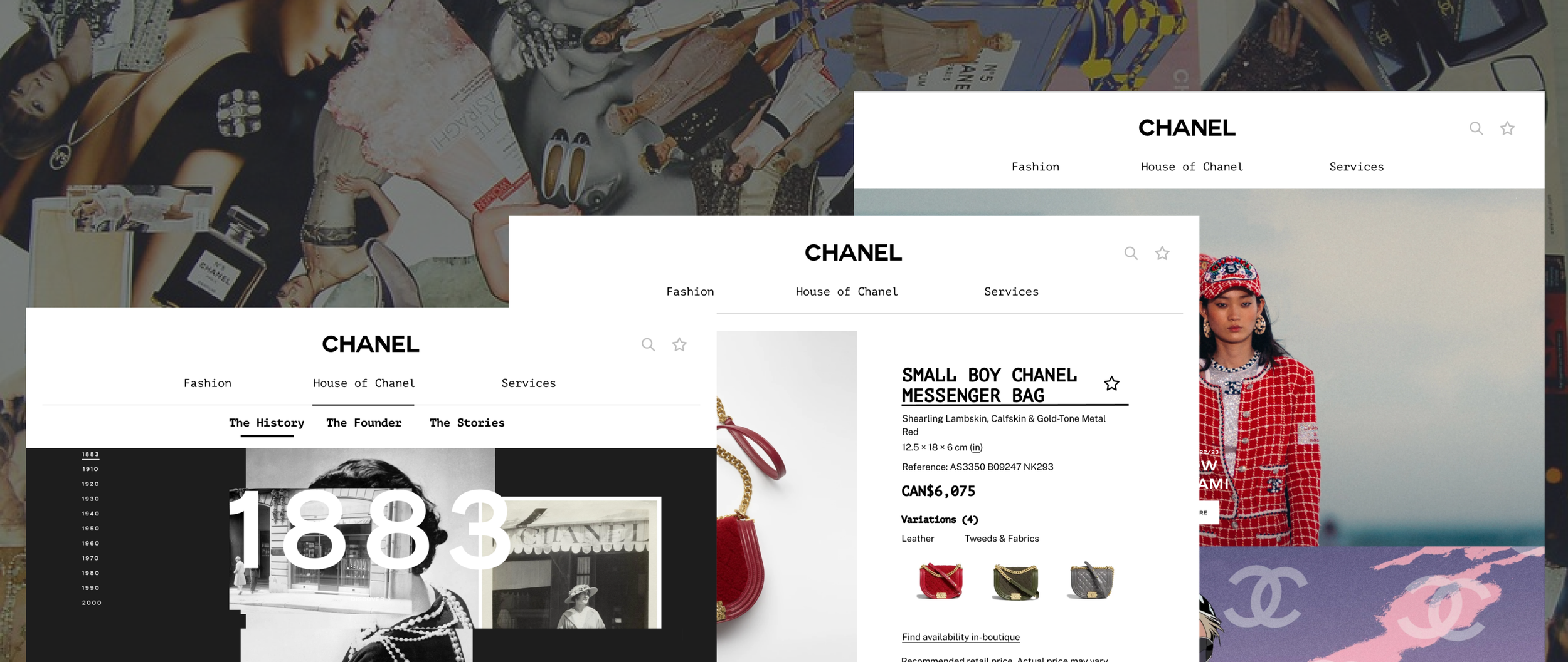
CHANEL Website IA Redesign
* This project is not affiliated with CHANEL, it is used as a case study at the University of Toronto. The background and photos of the company are used for education purposes only. *
Team Members
Deuscies Chang-Ou, Sixiao Zhang, Xiaoman Liu, Yingxin Cui, Yun Long Feng
Tools
Figma, Miro, Optimal Workshop, Treejack, Balsamiq
Project Goal
As a leading model of luxury fashion brands, Chanel’s website should show a prestigious way of treating its customers in the online environment as well. Our goal is to make Chanel's website the frontier of its kind, and hoping it will influence other fashion websites to face and fix their common issues for their users. Despite the elegant visuals and UI of its current website, users face difficulty navigating the CHANEL website.
Design Process

Background Research
Currently, the website has a hybrid function, mixing between letting users browse its online catalogue, and only making some of their products purchasable online. Due to the lack of purpose clarity, we believe the gap between catalogue browsing and online purchase should be bridged easily, allowing users to browse the online catalogue and find the products they are searching for. Further, the users should be able to obtain necessary information about the product’s materials, price, and availability, to guide their purchase decision. It also faces some issues regarding a clear sense of navigation structure, the limited navigation led to issues that send users with mixed signals and speaks the lacks the flow of consistency.
Data Collection / Analysis
Method:
20 Participants were recruited to participate for the survey. Most participants were students between 18 and 28 years old, who had experience using a fashion brand website before, and most of them used fashion brand websites for shopping.
3 Representative users were selected. 2 of them are male and 1 of them is female. These users are considered representative because they used fashion brand websites before, and they usually use these fashion websites for shopping.
There are 3 parts to our usability test: a Free Exploration time for users to explore the website Task-orientated Usability Testing, and a Post-task Interview.
Summary of Findings:
Repetitive Naming: Different Categories using the same label reduced task completion rate
Lack of Connection: Subcategories and Contextual links does not match the Second level categories
Non-Intuitive Information Architecture: The organization of the information architecture is confusing and does not make intuitive sense
Ideate
Card Sorting
For Card-Sorting we didn’t modify any card labels, we gave participants the freedom to create new categories. 4 users created 4 different categories called “About Us”, “Accessories”, “English for Savoir-faire and Literary Rendezvous at Rue Cambon”, and “Special Collections.”
We kept the original labels for all the cards because we realized the lack of Categories in the sub-menu under “Fashion”, and we want to see if this is an issue also faced by our users.
37 participants were recruited
10 participants completed the card-sorting
Key Findings:

The IA before were very confusing, cramming many things under fashion and doesn’t have sub-categories,
The sub-categories are at the bottom of the page, hard to find
The old IA “Online Services” are only included at the bottom of the page
3 were selected for further interview
Our users have the most trouble sorting ‘Lastest Fashion Shows’ and the ‘In Boutiques category’.
Participants’ categories were labelled very differently than the original structures.
Participants had trouble identifying fashion shows and issues with labels depicted in French. Many name-specific labels do not have a proper translation and require prior knowledge.
IA Schematic Diagram
IA Before


What Changed?
IA After

For a detailed IA Diagram you can check it out on Miro

Labeling
No change to preserve Chanel’s French identity
Chanel enthusiasts might be familiar with these labels
Solved confusing Labelling through better category organization

Make it more accessible for both the customers who want to purchase products and customers who want to explore Chanel culture

Include everything from fashion shows to accessories (shopping-related labels) under the Fashion header and separate products into sub-categories.

Created a special “Services” label for access to Career, FAQ, etc.
Orgnization
Categorized labels to cater two types of users
Fashion -> Fashion product purposes
House of Chanel -> Chanel enthusiasts beyond products

Navigation
Fashion, House of Chanel, Services
Slight modification so that users can quickly adapt to changes
Easily access all content wherever they are on the website
Prototype
Low-Fi Prototype

Storyboard 2: Explore the history of CHANEL

Hi-Fi Prototype
The new IA demonstrates improvements in search time and convenience, by incorporating popular item names directly under their category
Successfully separate customers who have different needs when using the website and provide them with fast access.
Storyboard 1: Search the materials of a Chanel messenger bag
Tree Test
To obtain more details about users’ preferences and behavioural patterns on our redesigned information architecture, we asked our participants to execute 5 tasks using our new IA
78%
Success Rate
32%
Directness Rate
The low directness is not considered an issue because the CHANEL website’s branding is not mainly focused on selling products, clicking and redirecting lead users to a more immersive experience.
The new IA design significantly boosted the possibility of correctly clicking the second tab and ultimately influenced the success rate of landing at the correct destination.